Project
MIXTAPE
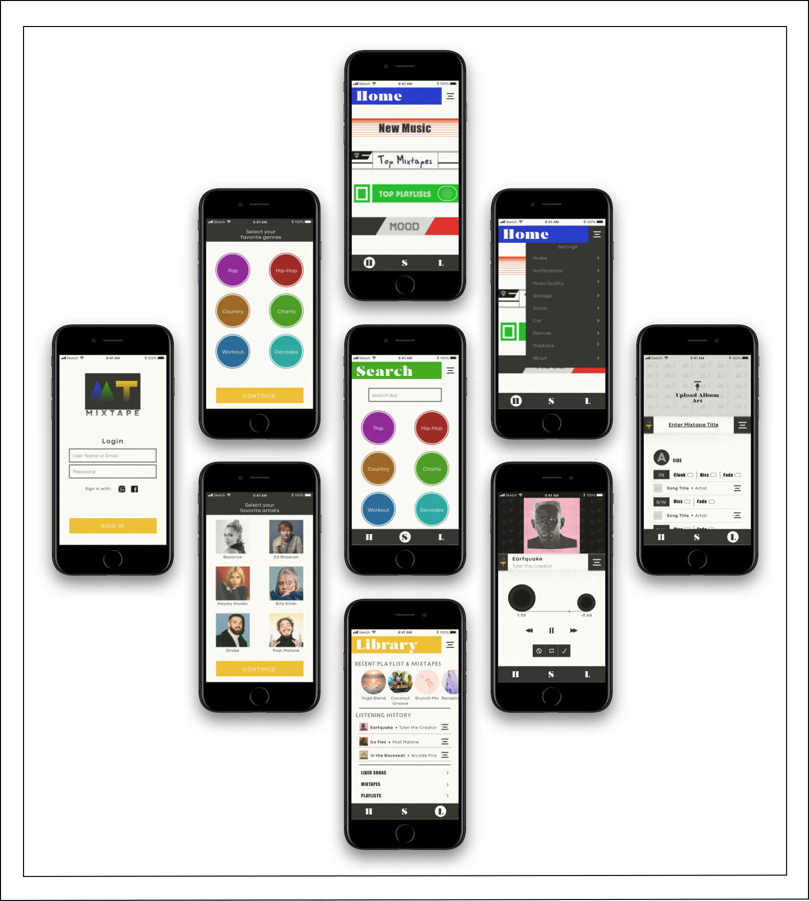
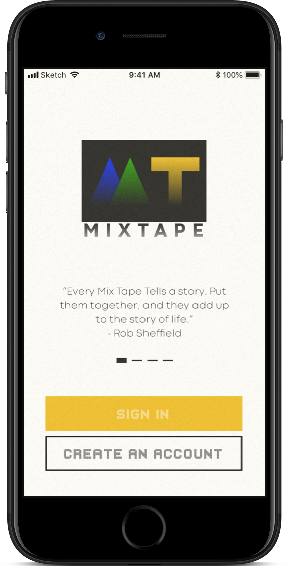
Mixtape is a music streaming app that reintroduces users to the beauty of curating a short playlist. Twelve or less songs with options to add sound effects like the clunk of smashing a cassette into place, a two-second hiss between songs or perfect fade. Custom cover art and fun title fonts, users can go back to a time when pairing songs together was an art form.
That’s not to say Mixtape leaves anything behind. All the bells and whistles of a modern music app is here, and yes you can still create a 200 song playlists if you like.
Date: 2019
UX Design
UI Design
Icon Design
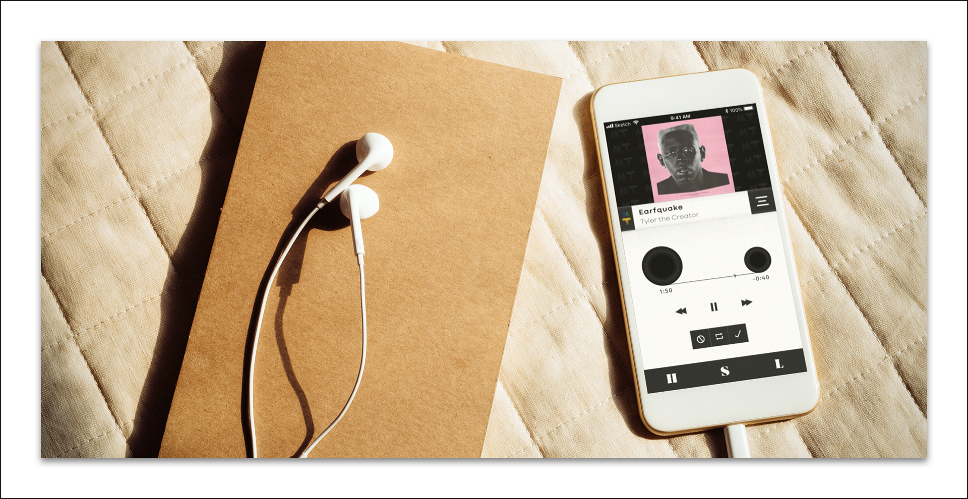
Photo by Porapak Apichodilok
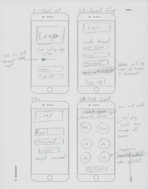
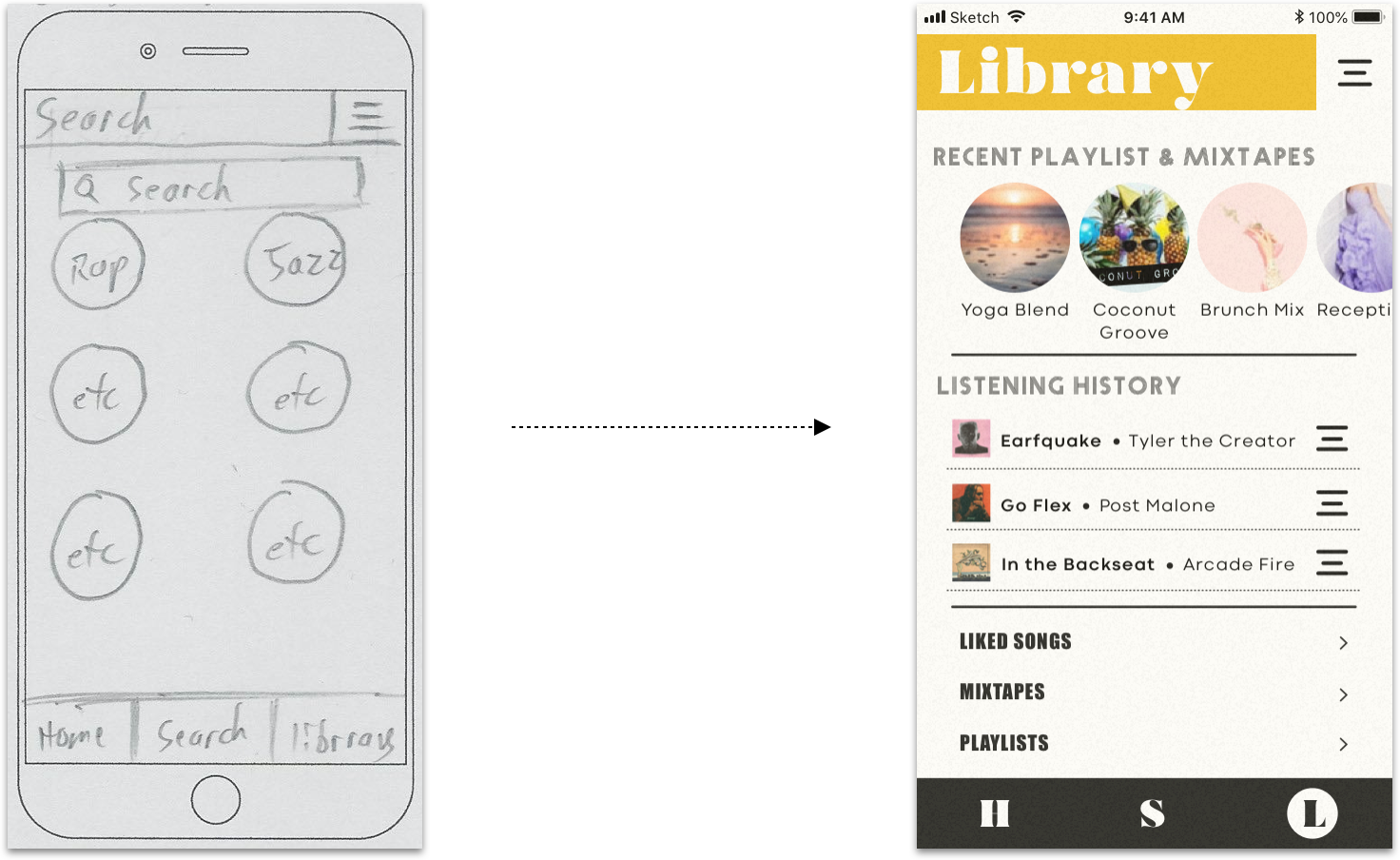
Wireframes

The visual design of MIXTAPE is inspired by the music hardware from the ’80s and ’90s. The core challenge was reintroducing those designs to today’s audience in a way that felt vintage but still modern.


Concept

The visual design of MIXTAPE is inspired by the music hardware from the ’80s and ’90s. The core challenge was reintroducing those designs to today’s audience in a way that felt vintage but still modern.
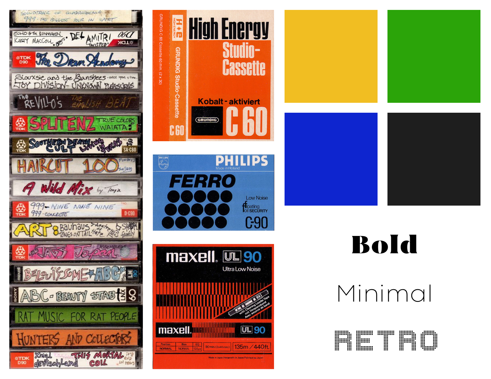
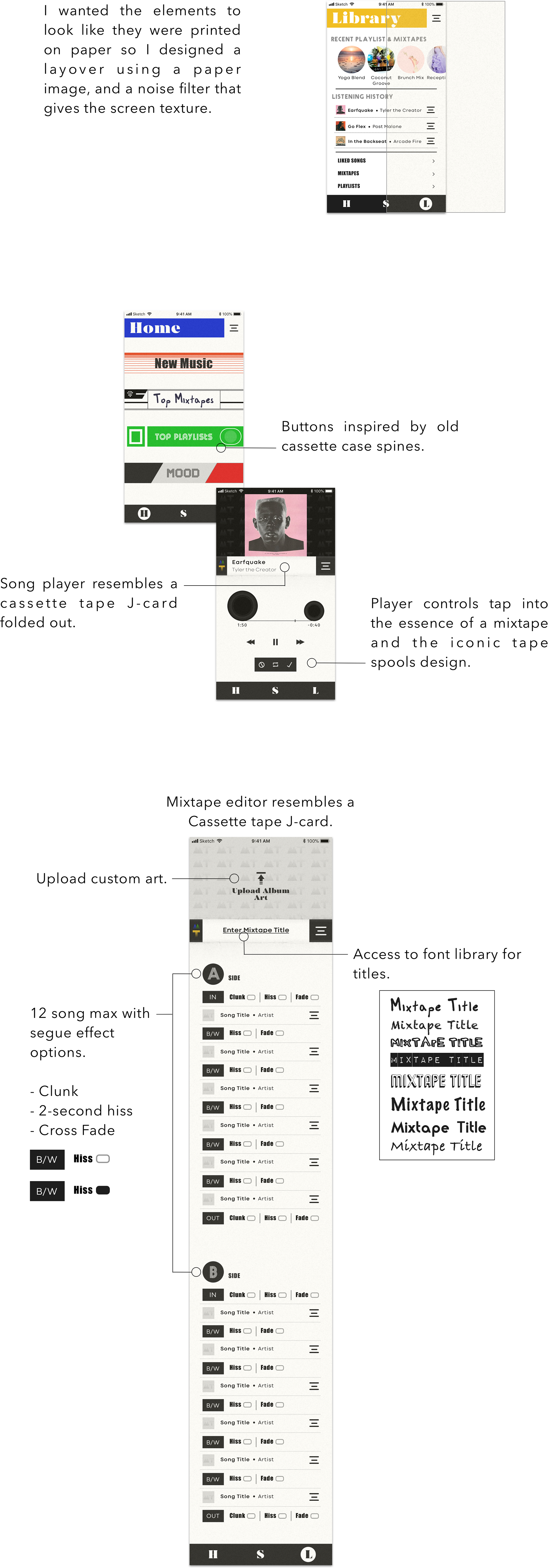

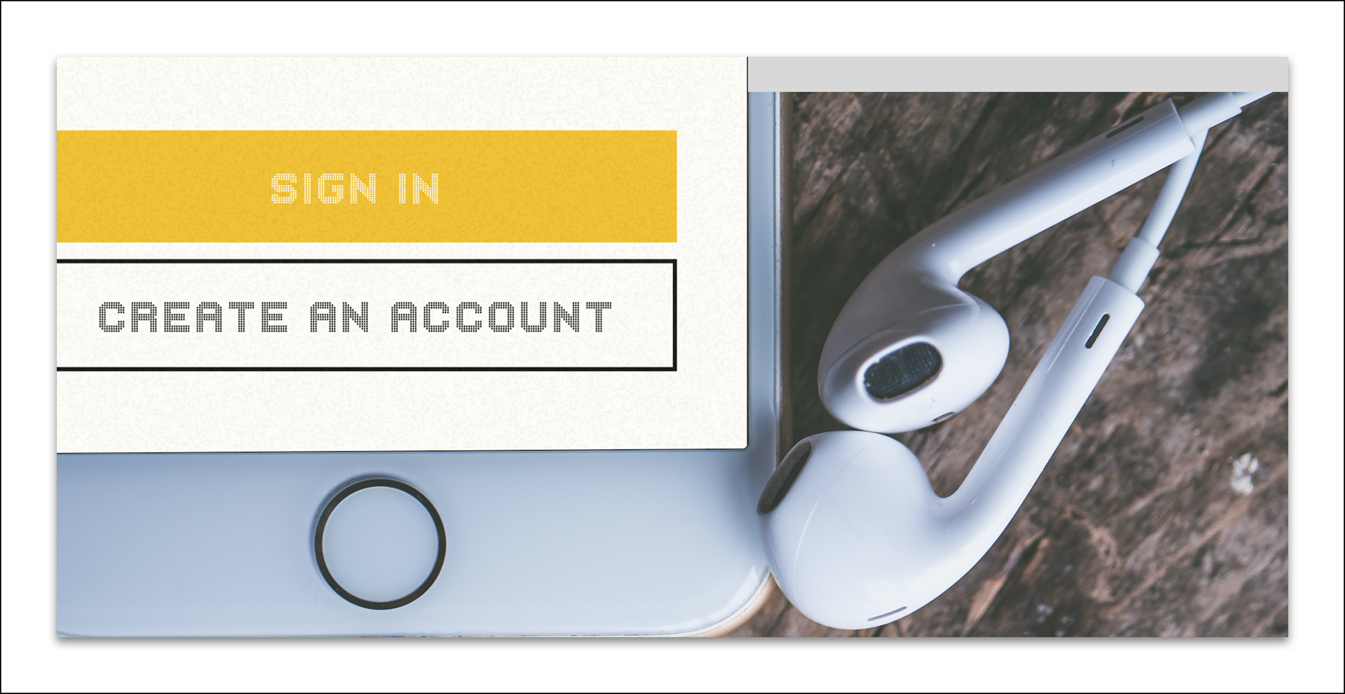
Photo by Jessica Lewis
Color

Color is an important marker of time. The mint green appliances in the ’50s, brown hues in the ’70s. For MIXTAPE I chose shades of Blue, Green, and Yellow because deep hues with bold black patterns were dominating the '90s.


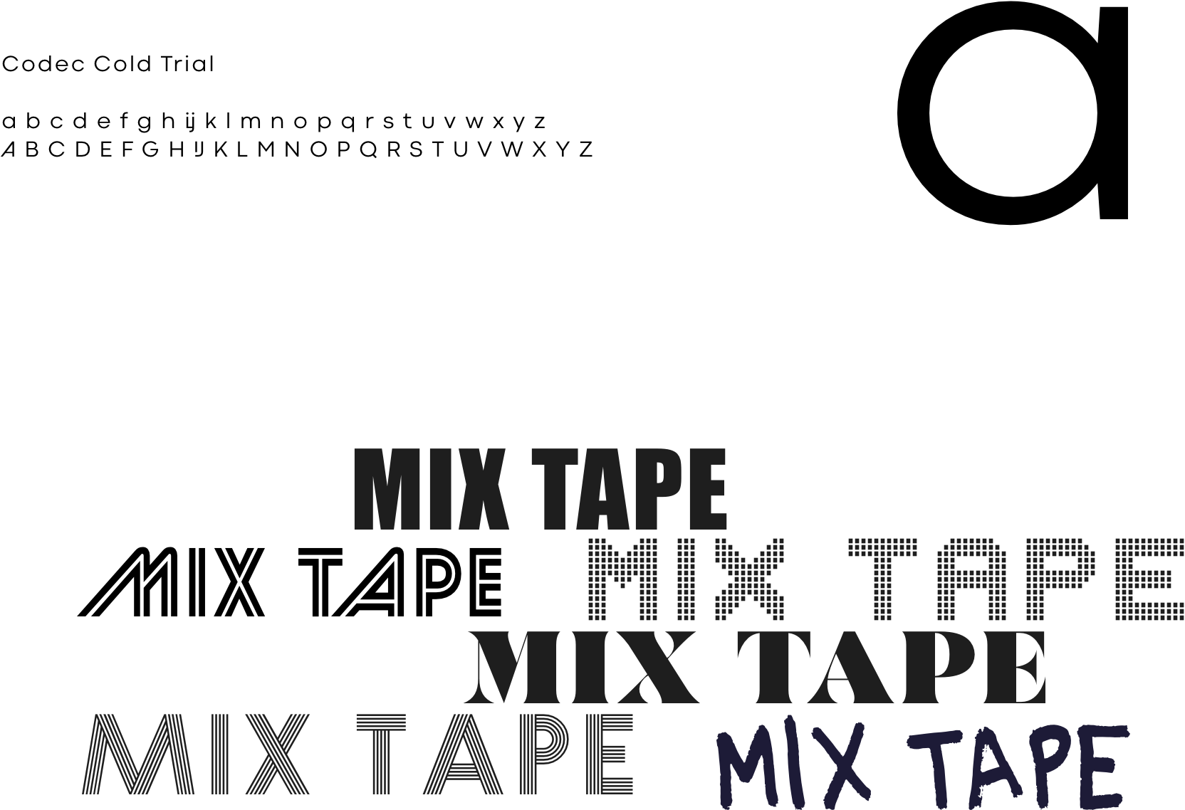
Typography

Most projects require no more than two different types. After researching the past, it became clear this wouldn’t be the case for MIXTAPE. The ’90s were saturated with cassette tape brands, and consumers became inundated with a mosaic of type families. To reflect this truth, I had to carefully select types to paint a vibrant layout.

Iconography

While some rules can’t be broken, enlarging some of the modern icons helped balance the vintage designs.