Project
Glance Report
Glance Report is a cool website utility that sources the leading headlines from news outlets across America. Users can scan headlines quickly and with one click, expand the article into view, never needing to leave Glance Report. With this feature, users can quickly see what news is being pushed across outlets. And that means all outlets. Progressive, conservative, neutral, Glance Report is unbiased, and still respectful, offering users a sorting filter to complement their preferences. A fun idea, I was excited to work on.
Date: 2020
UI Design
Icon Design
Problem
User feedback was showing my client’s site felt untrustworthy. How can we redesign Glance Report to feel more welcoming?
Solution
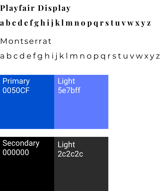
Glance Report needed a visual design makeover. Information architecture and UI layout were positioned well so I focused on building a consistent typographic hierarchy and color scheme.
Competitive Analysis
I began by looking at trends on the news outlets Glance Report sources from. Their color schemes. The font choices they made. The color white is the most common background color and Serif fonts were popular for headers. Not too surprising. Both choices are very common with sites where the main function is to read large blocks of text.


Iterations
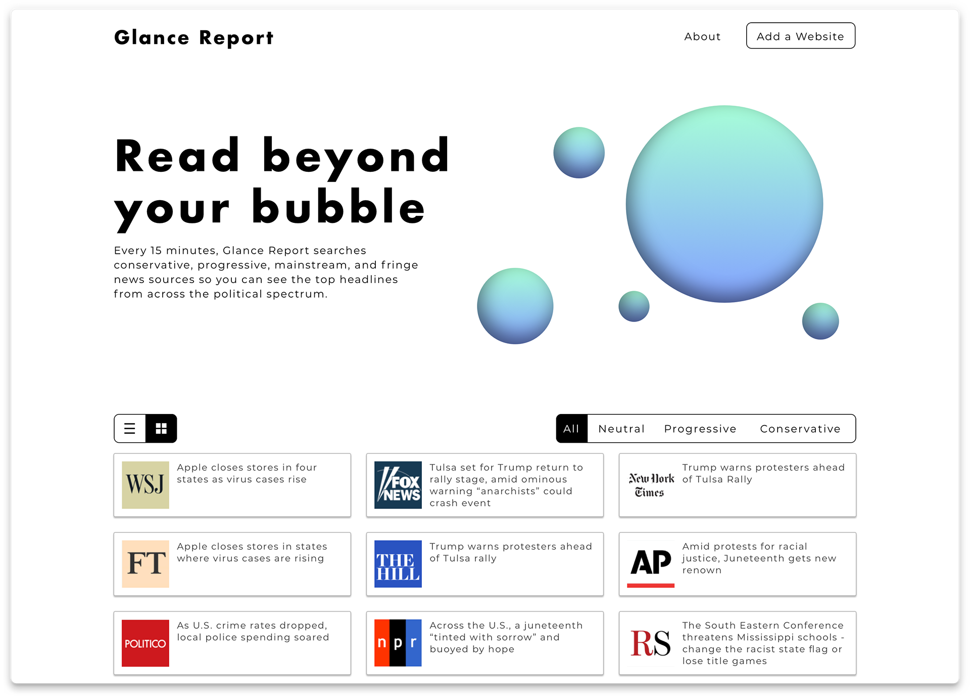
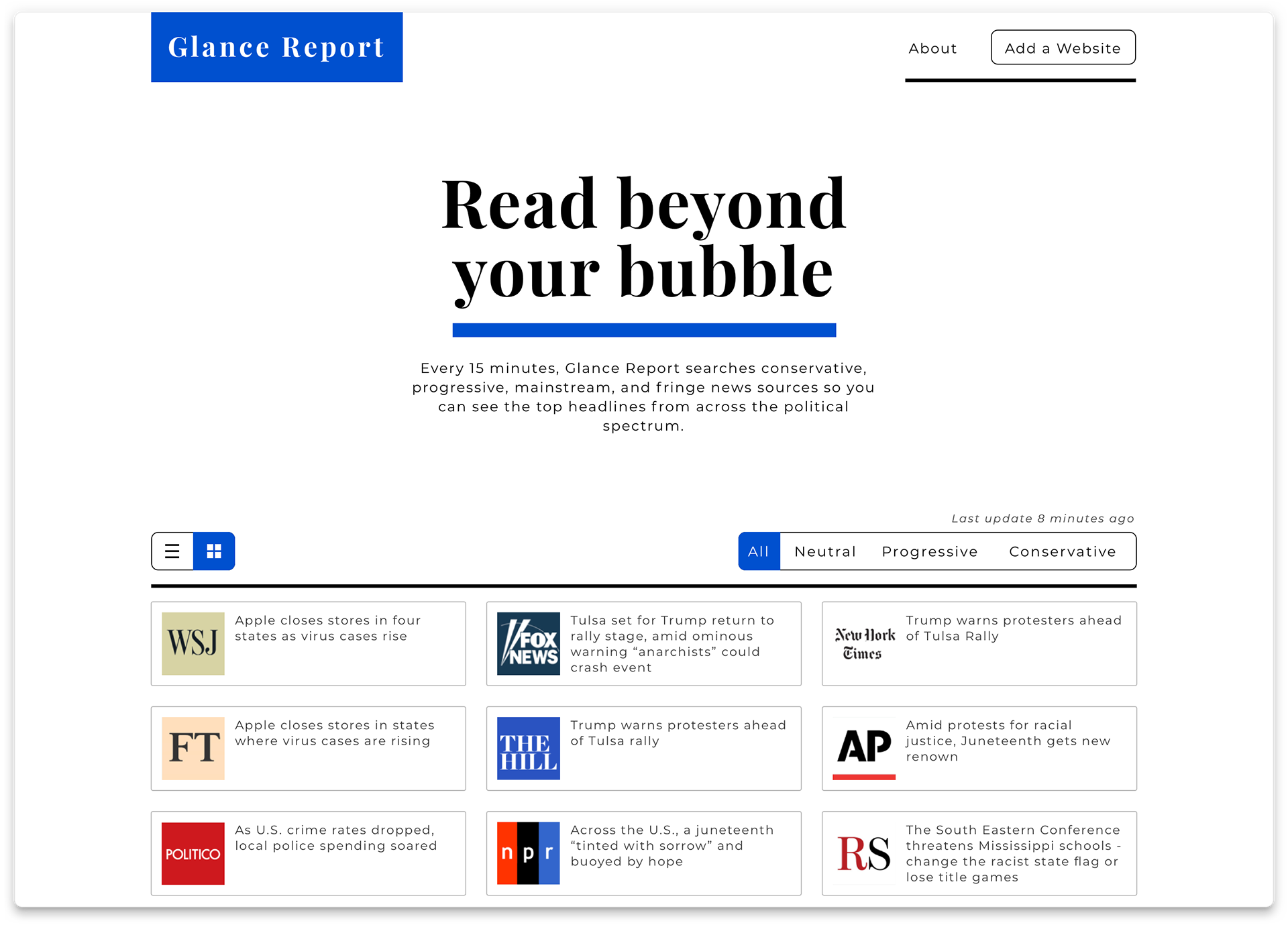
Because our site isn’t a conventional news website, I explored two different looks for this project. One I call Utility and the other Formal. The Utility is more fun and modern, while formal is traditional and professional.
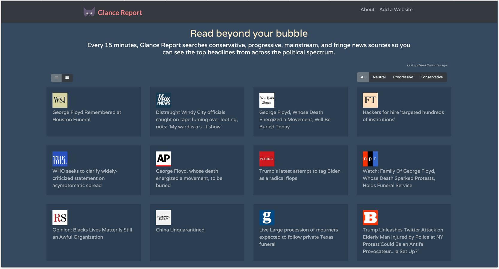
Utility
This design was made with the intent to feel friendly. I used a relaxed San-Serif type for headers, and animated a playful illustration to work off the welcome text “Read Beyond Your Bubble”.
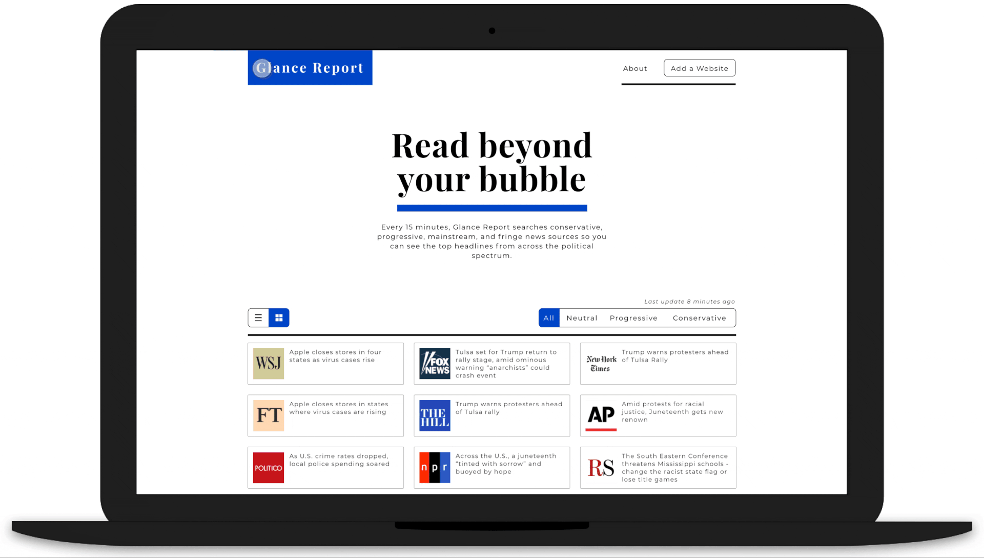
Formal
This design pulls most from my research of news websites, and gives a greater feeling of respectability and reliability.
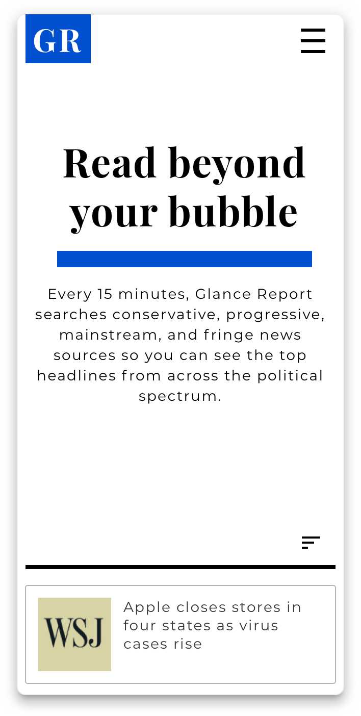
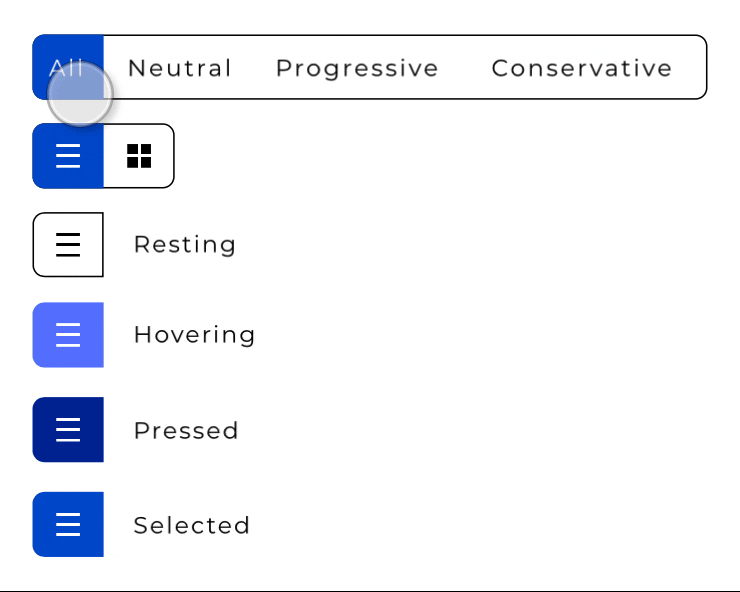
The list/tile filter disappears when viewed on mobile and the sorting filter collapses into a button.
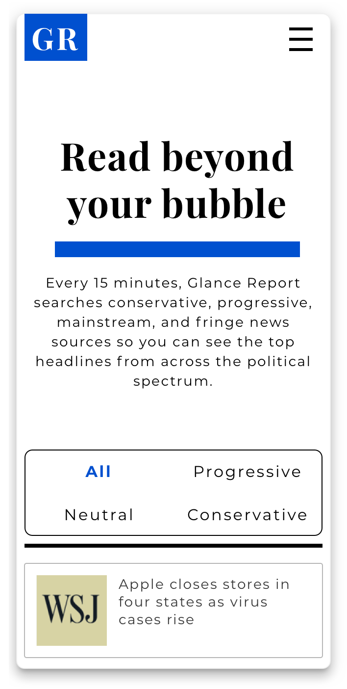
The sorting filter when expanded is spacious for mobile tapping, and the selected theming was changed for aesthetic reasons.
Conclusion
The formal design won my client over in the end, and I feel they made the right choice. I think users will respond well to a formal design. Our project didn’t budget for preference testing, but as the site rolls out with the new design, time will tell how users are responding.
