Project
Confectionery
Desserts are a specialized profession in the food industry but when it comes to recipe apps, they’re just another food category. Confectionery offers an all in one resource for the dessert enthusiast. Recipes designed by professional pastry chefs and community members, interviews with renowned chefs, technique guides and achievement tracking to keep users hungry.
Date: 2019
UX Design
UI Design
Web Design
Icon Design
Photo by Marianne Krohn
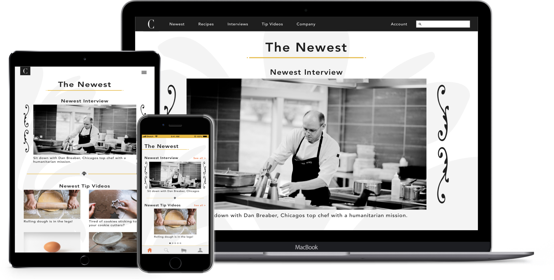
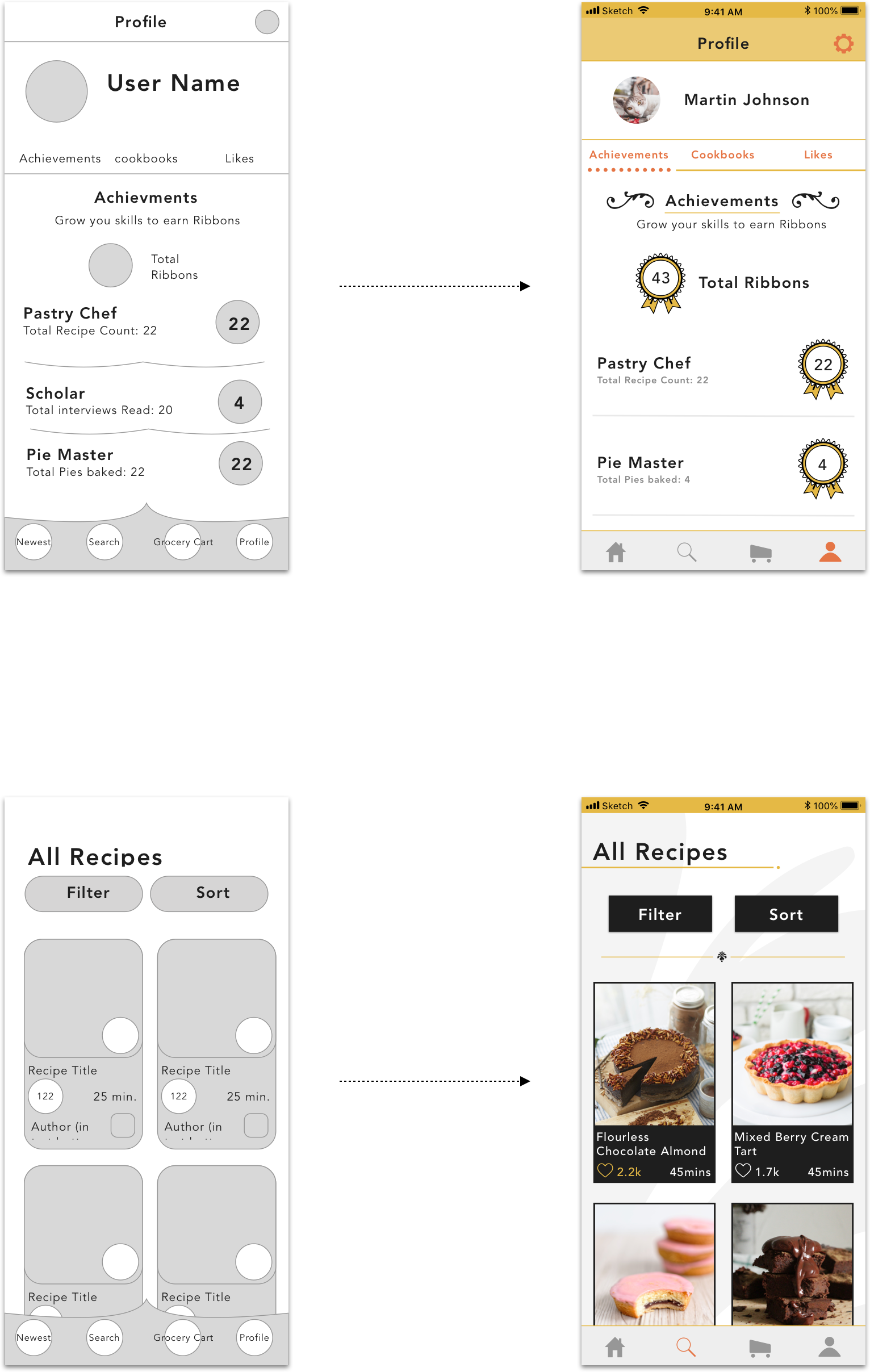
Wireframes

Early designs of Confectionery had a softer aesthetic with rounded corners, but this proved too playful and evolved into a more elegant look.

Concept

I wanted users to feel confident in the recipes and help guides so I designed Confectionery’s look after renowned culinary institutions where professional pastry chefs attend.
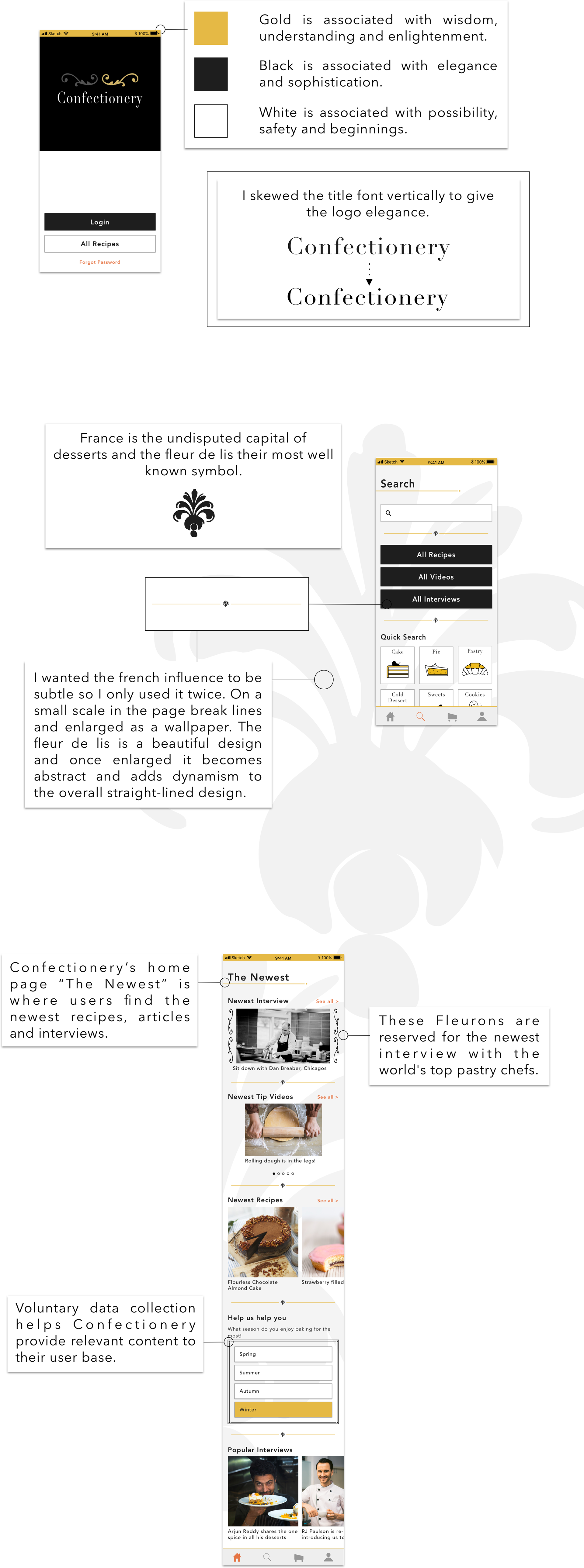

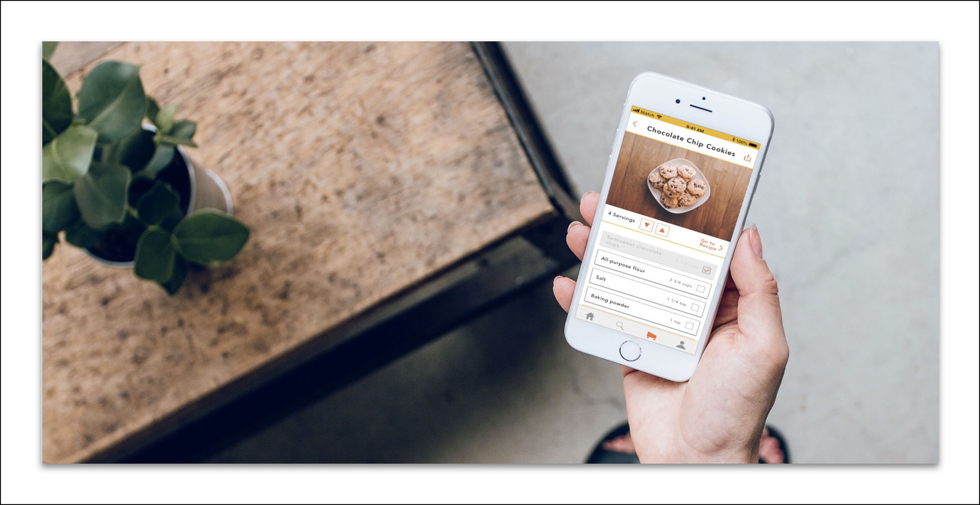
Photo by Le Buzz
Color

Confectionery’s color scheme was purposed with giving users confidence and safety with the platform. I wanted them to know they were receiving the best of the best in dessert help.


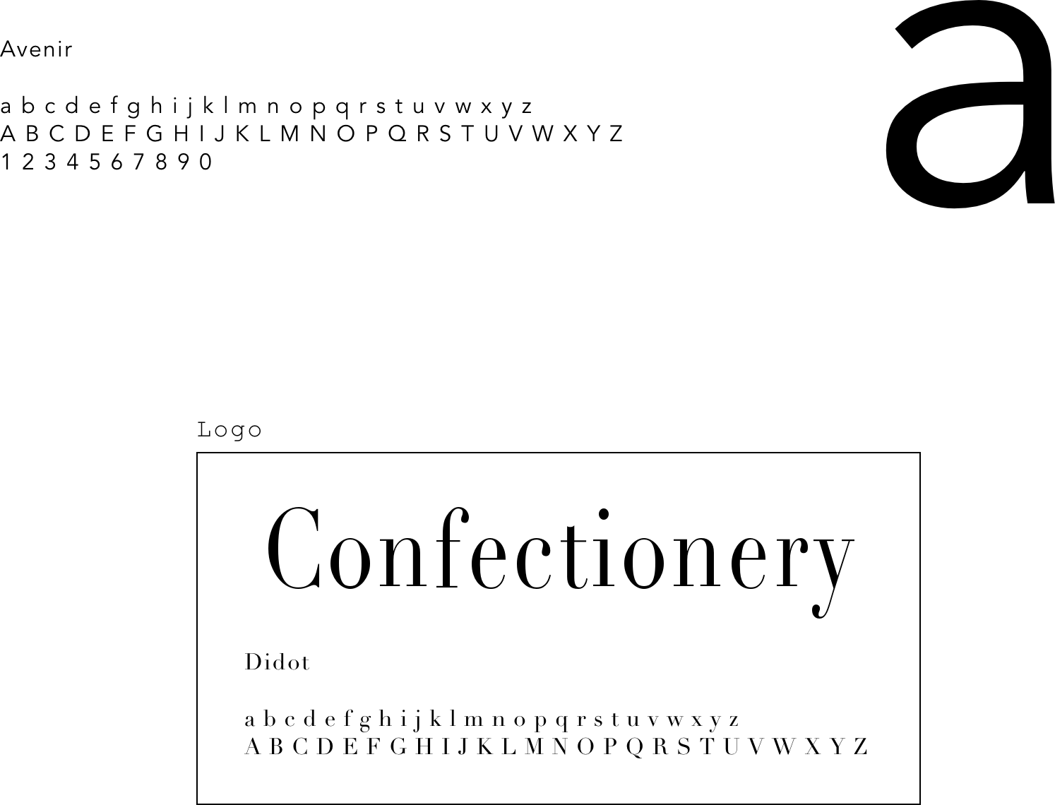
Typography

I reserved the type Didot for Confectionery’s logo because it embodied the essence of the app and gave a great first impression to the user. For the rest of the apps lettering, I chose Avenir for its clean legible type and it’s unmistakable talent to look attractive at all thicknesses.

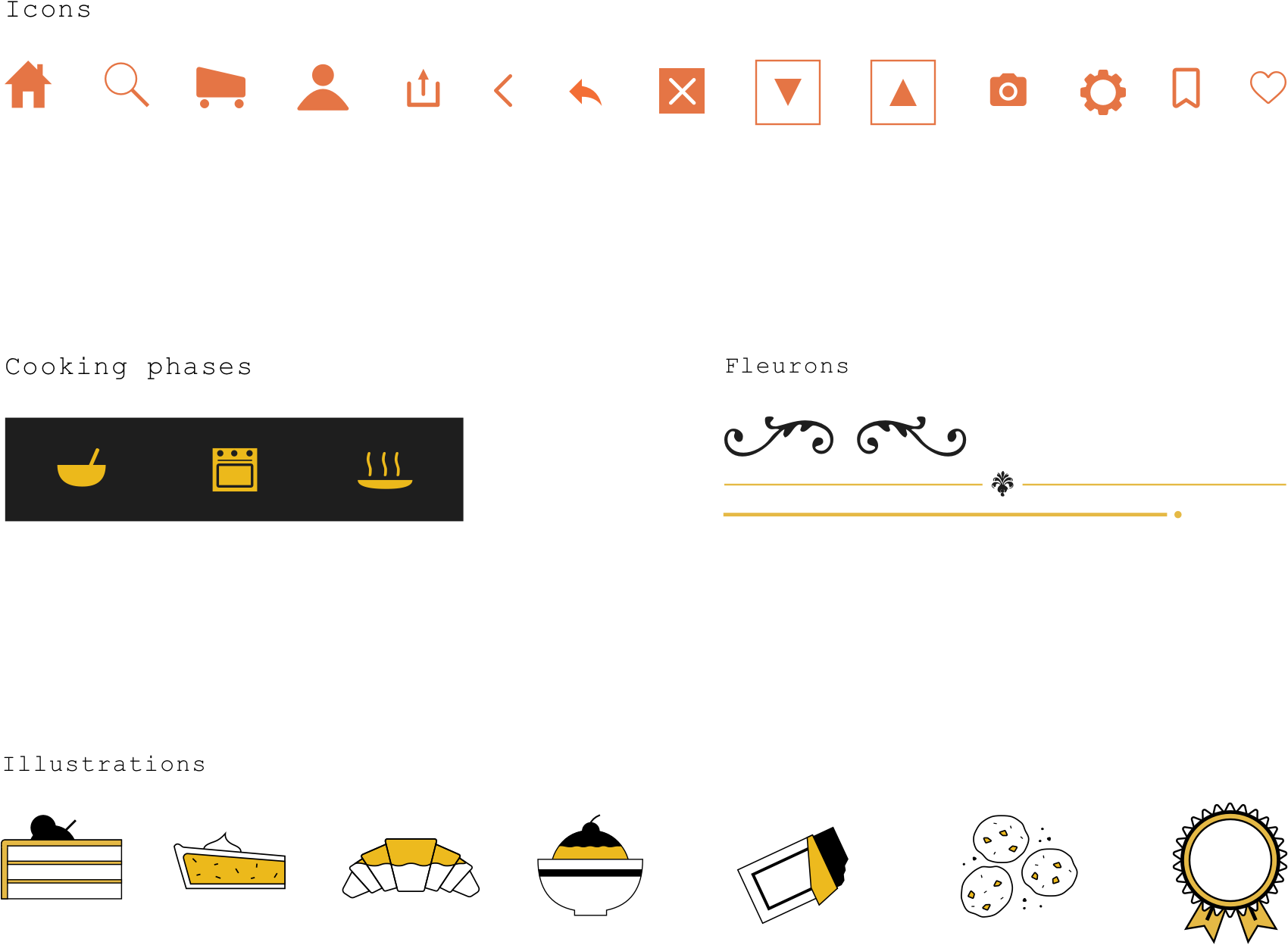
Icons & Imagery

I used the orange tertiary color for all icon buttons and reserved the gold, black and white color scheme for illustrations.